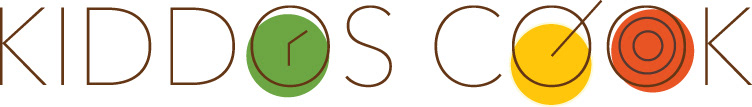
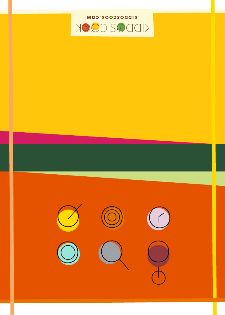
The base logo for Kiddos Cook utilizes the O shape in the words as a container for icons reinforcing important messages.

Fall Kiddos Cook Logo
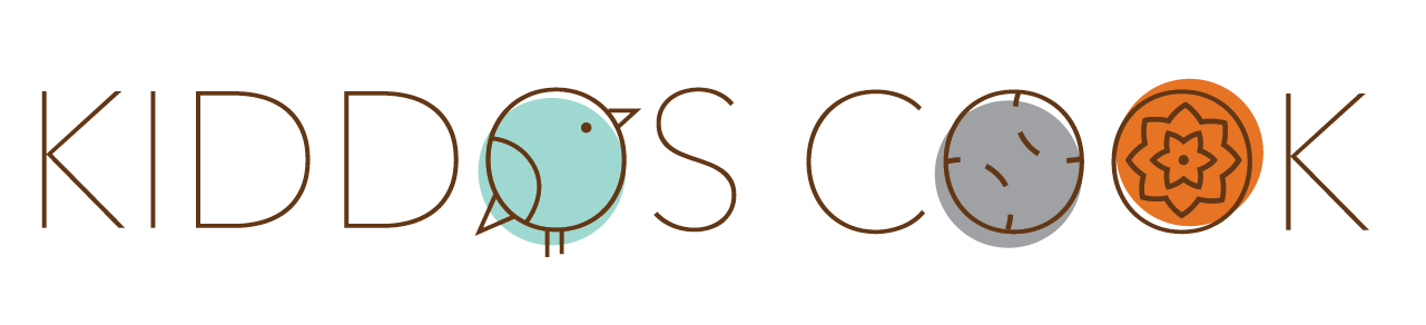
Spring Kiddos Cook Logo
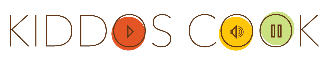
Podcast Kiddos Cook Logo
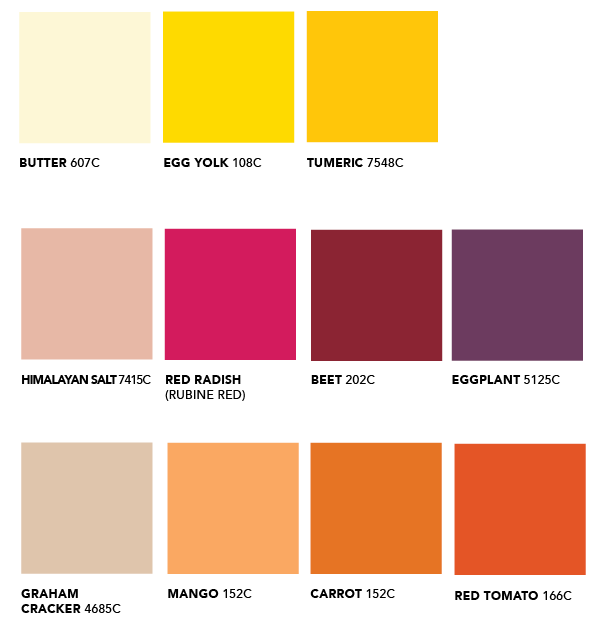
Kiddos Cook cooking-inspired color palette
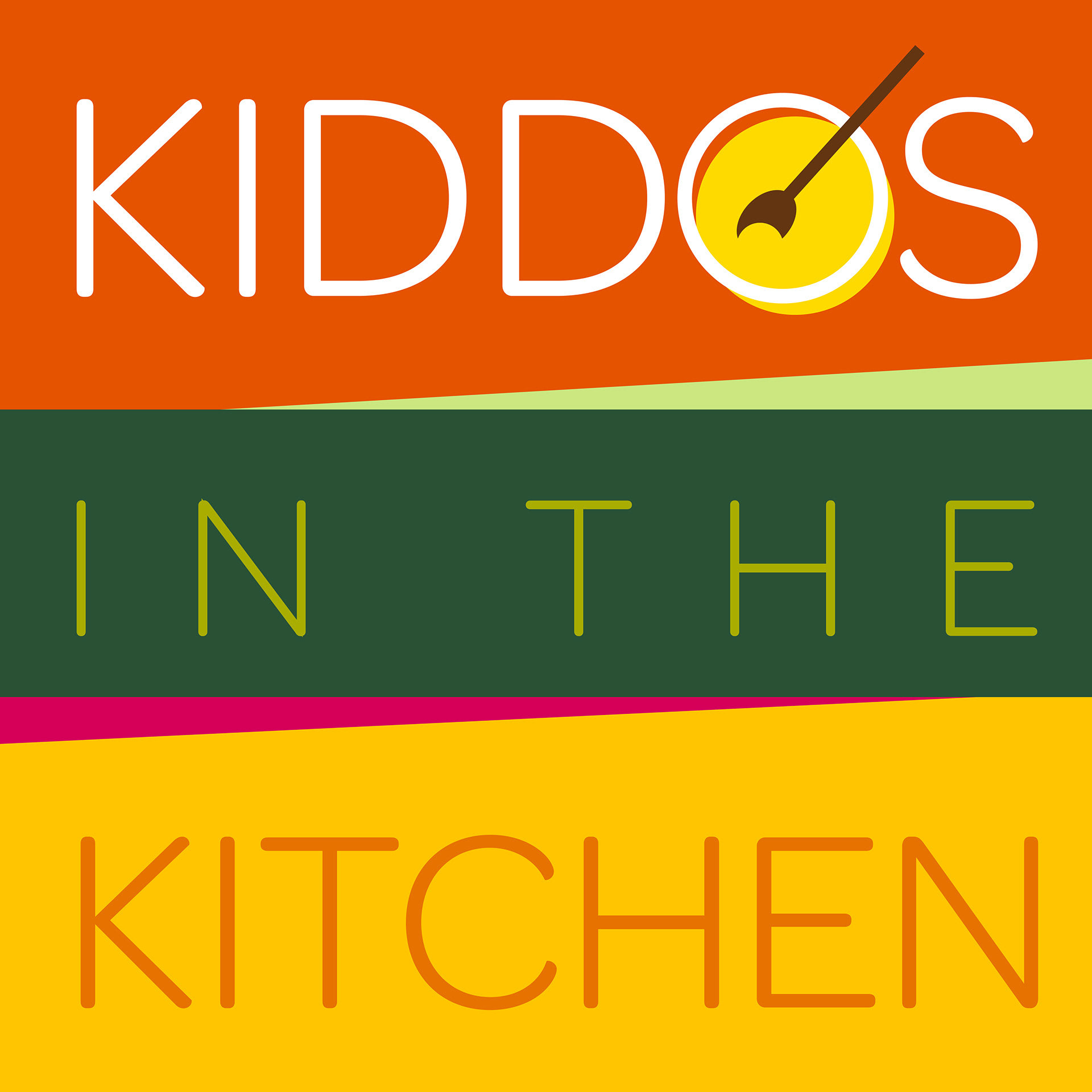
Artwork for 'Kiddos in the Kitchen', a podcast launched in 2019,
designed to stand out in the sea of cooking podcasts.

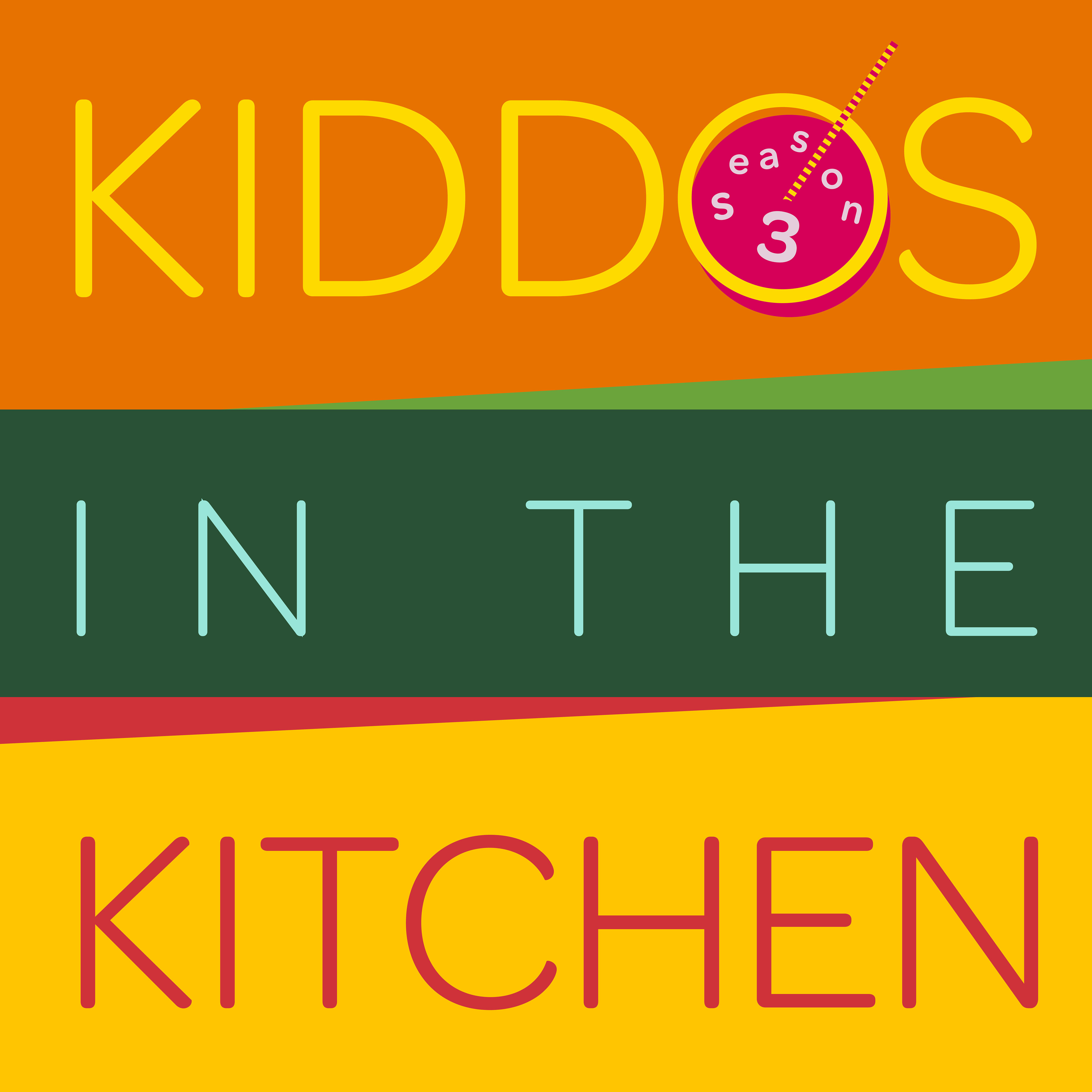
Kiddos Cook Podcast Logos | Seasons 2 & 3
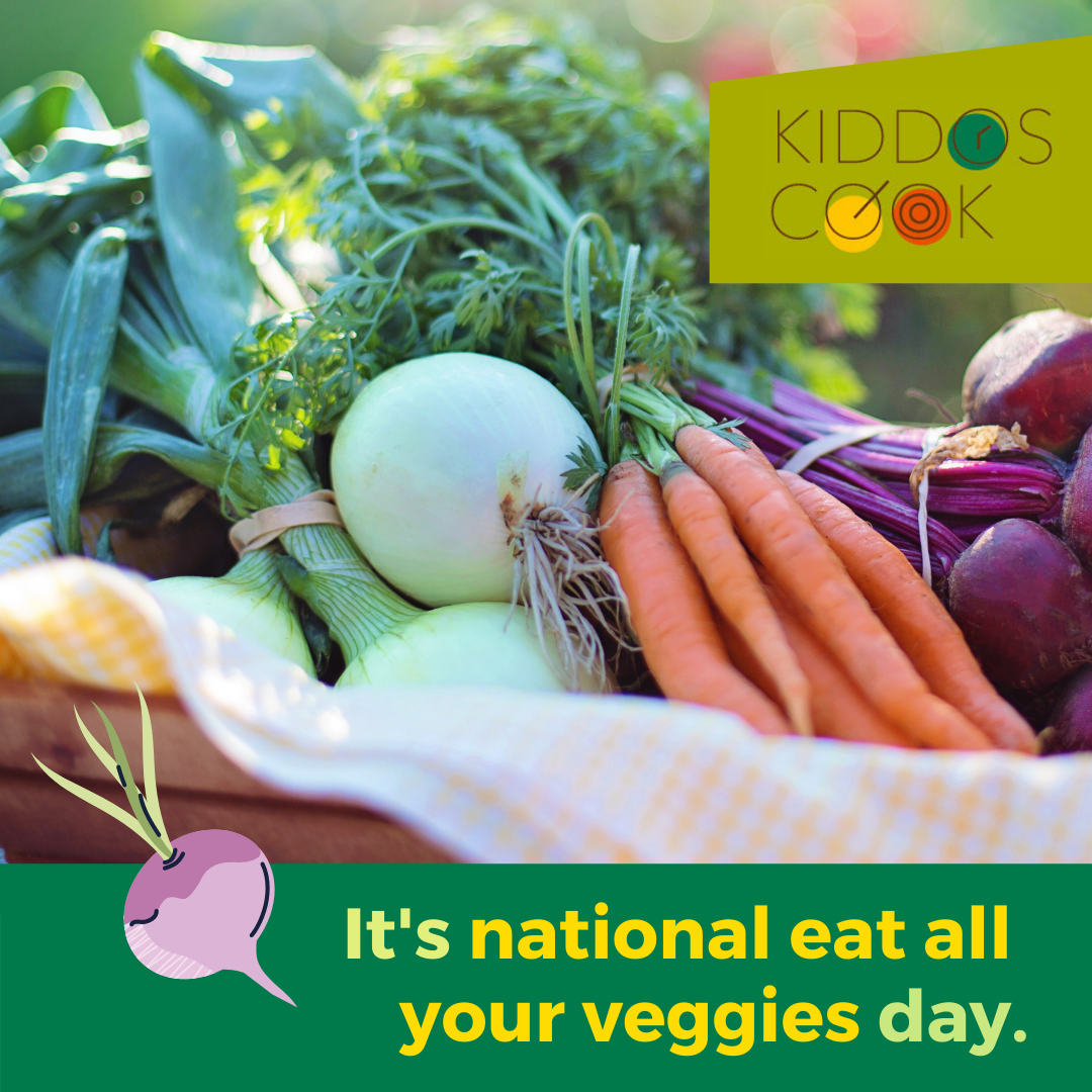
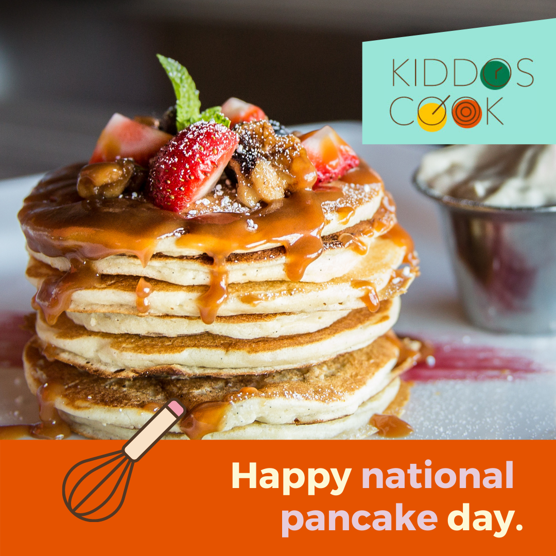

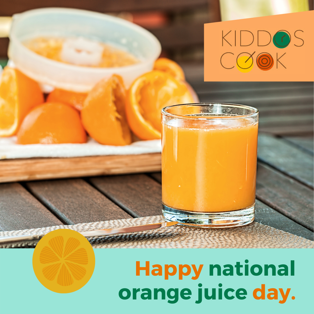

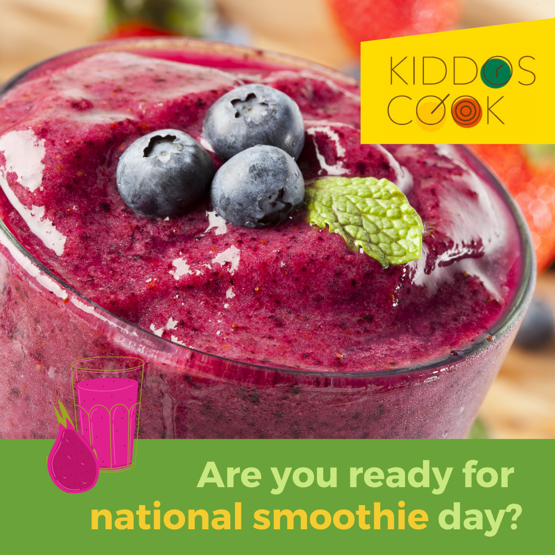

Kiddos Cook "National Food-a-days" Social Media Templates
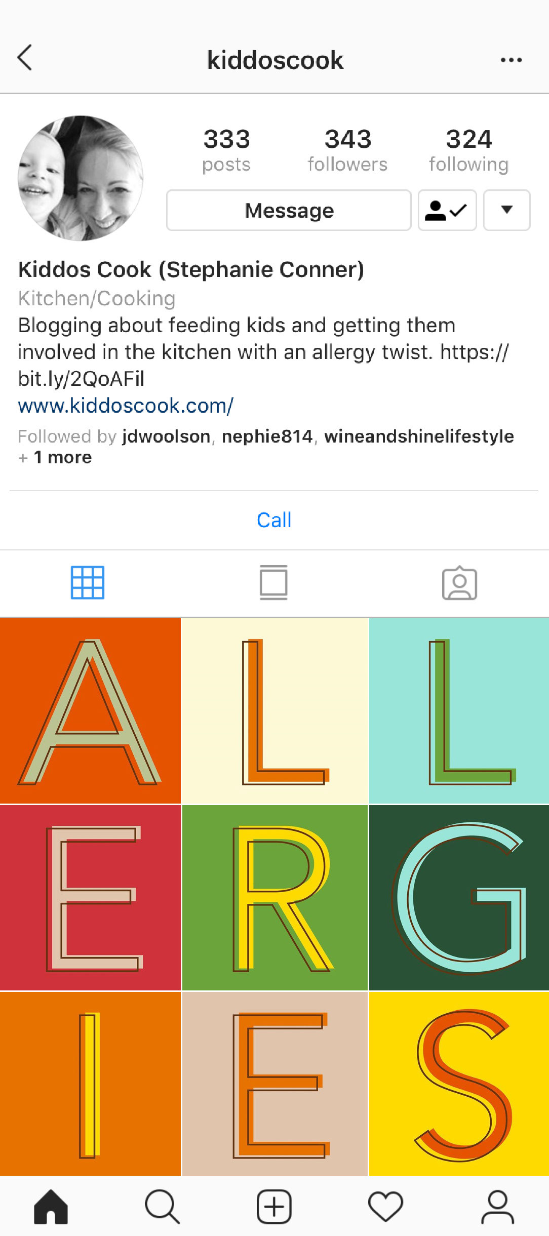
Instagram Takeovers are utilized to announce new features on the web site or updates to the podcast.
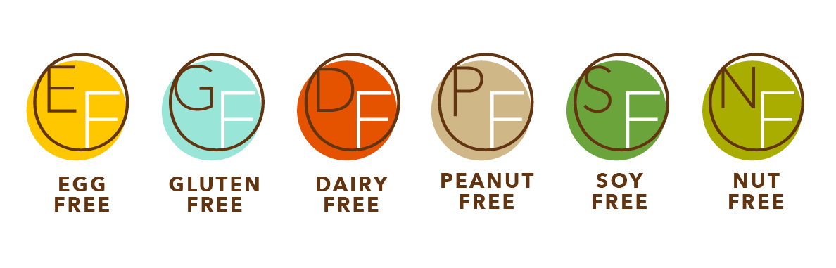
Each recipe is accompanied by these helpful icons to help the
home chef quickly narrow down which ones are right for them.
Kiddos Cook thank you cards

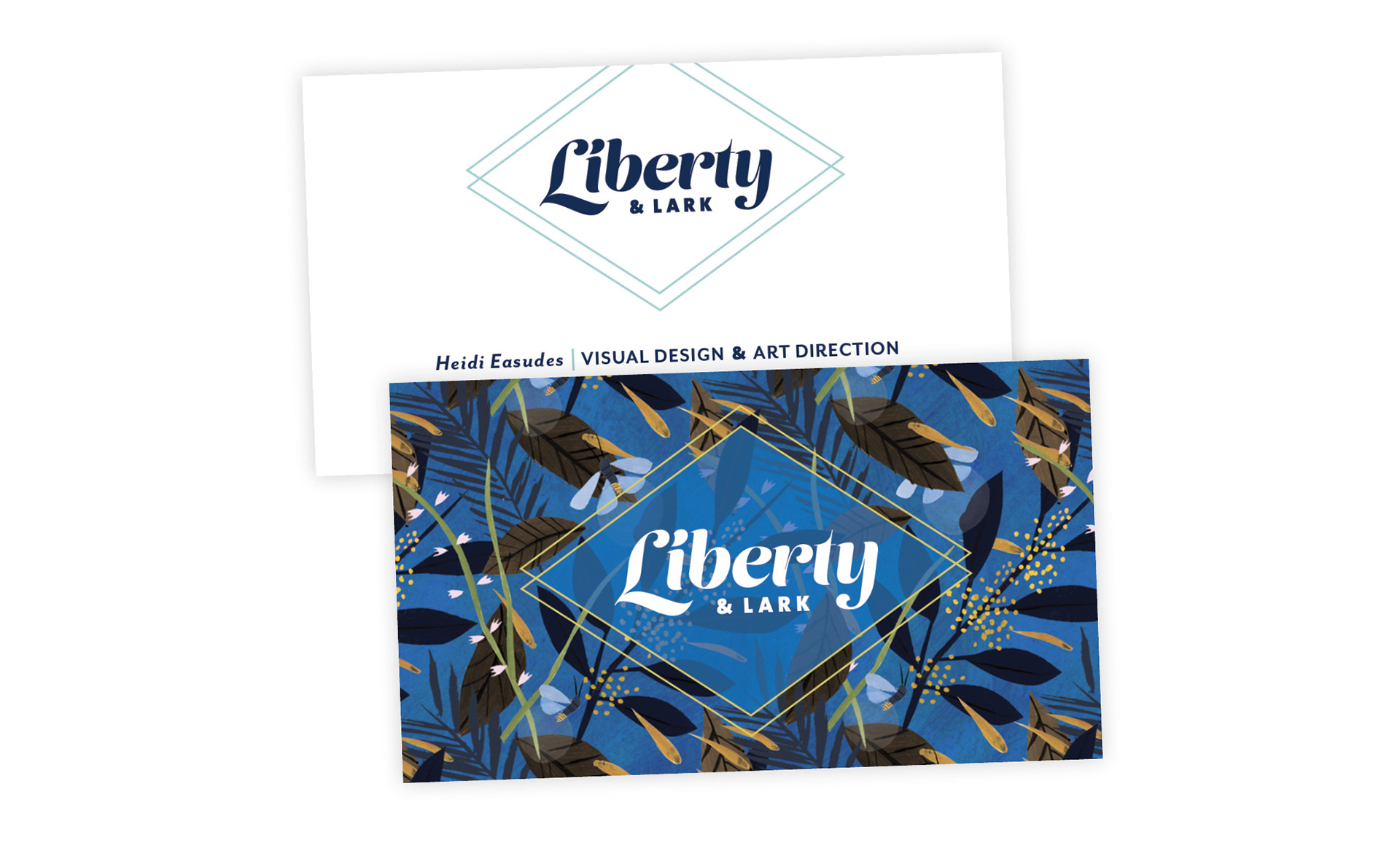
Liberty & Lark Studio Logo Detail
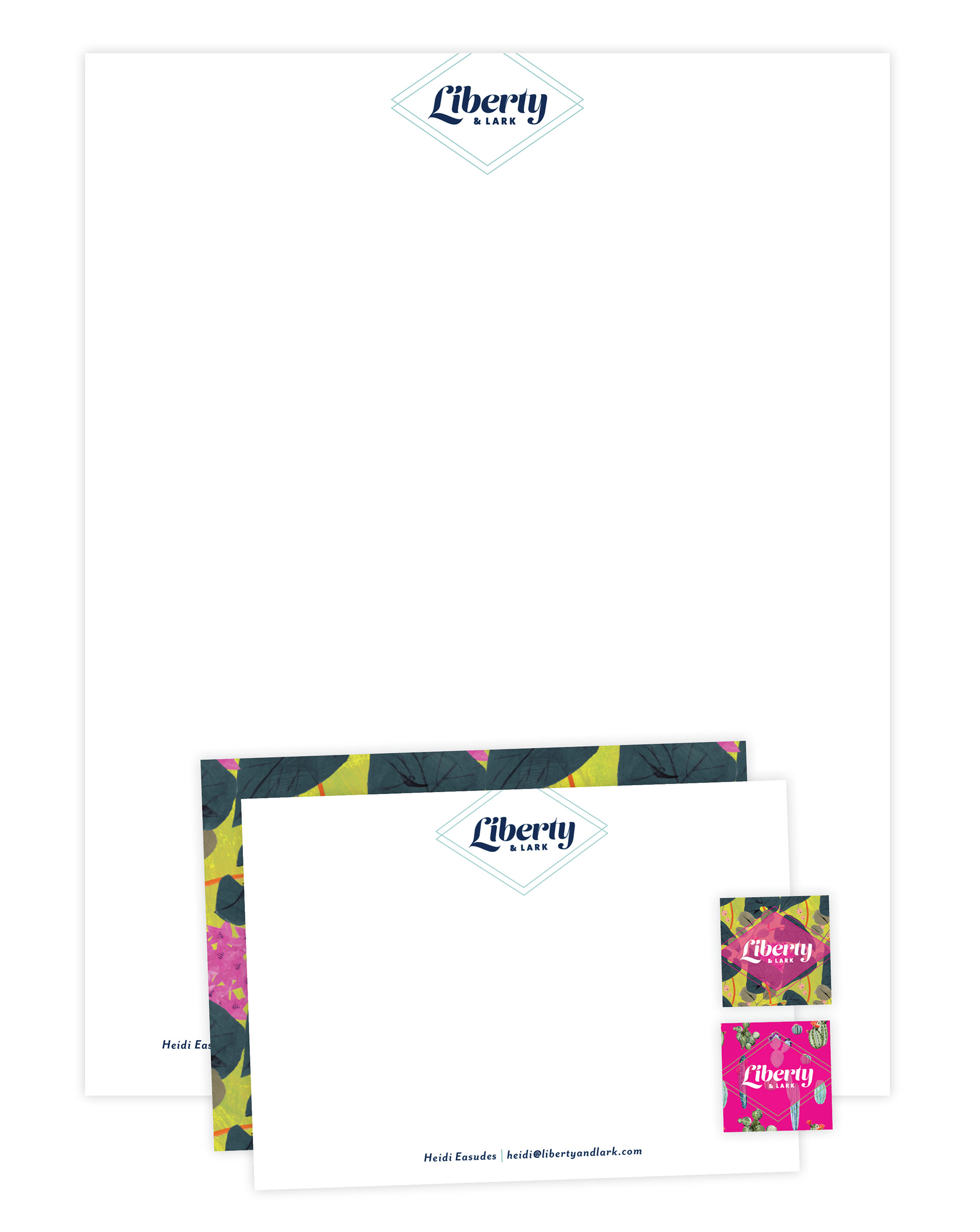
Liberty & Lark Studio Stationery
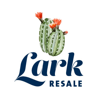
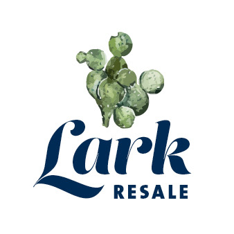

Lark Resale Logo

Farm Bureau Financial Services provides financial solutions and develops multi-generational relationships with the families they serve. They wanted to expand their existing branding to appeal to a new client base, while still being true to their midwestern roots. This led to a color palette update and a visual playbook for their marketing team. This mood board was designed to grow as the brand evolves.

Farm Bureau Financial Services Mood Board Introduction
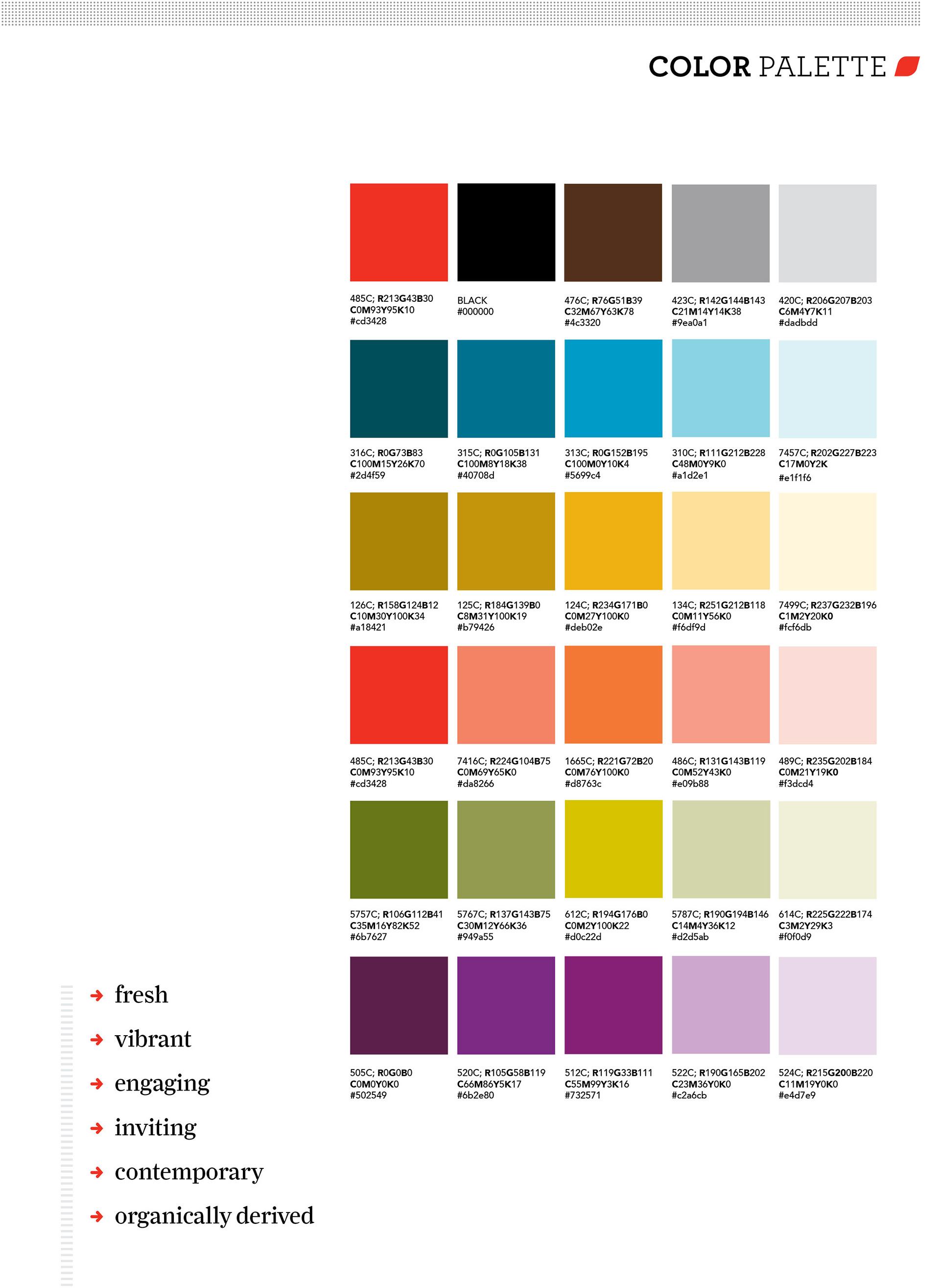
Farm Bureau Financial Services Mood Board Color Palette
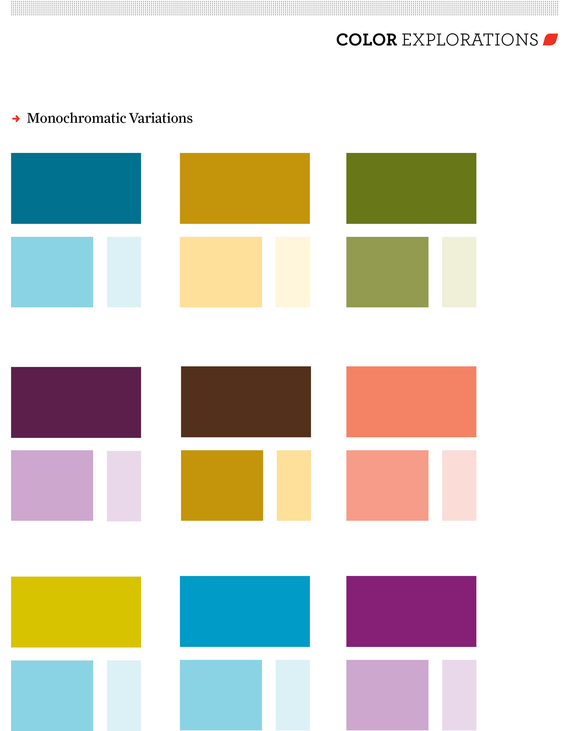
Farm Bureau Financial Services Mood Board Color Palette Variations
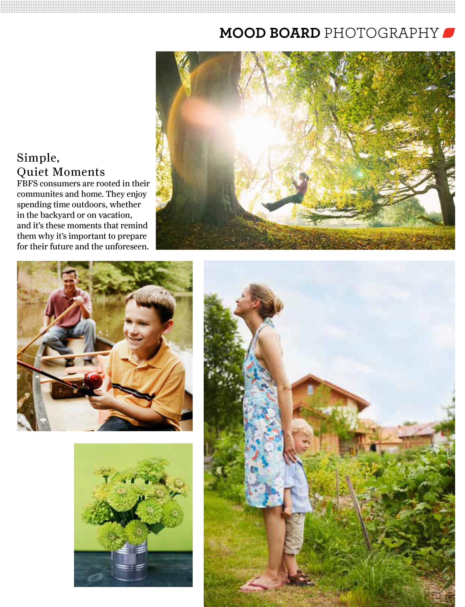
Farm Bureau Financial Services Mood Board Photography